Toka Tū Ake EQC
Client
Work
Brief
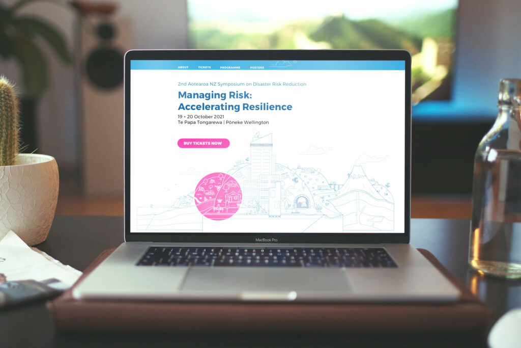
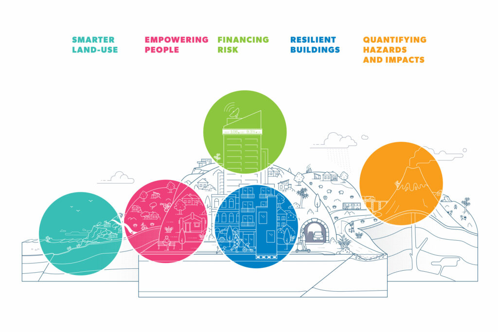
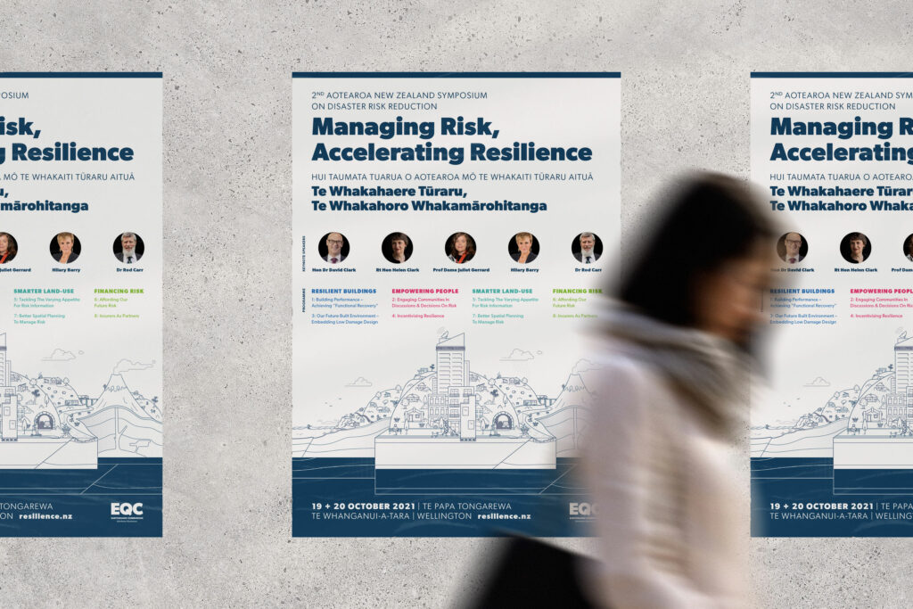
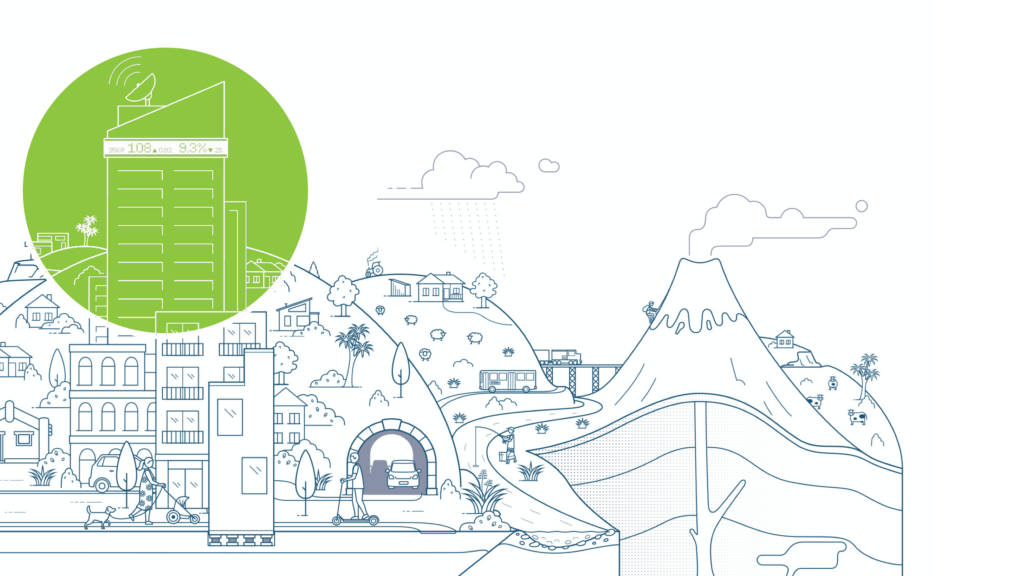
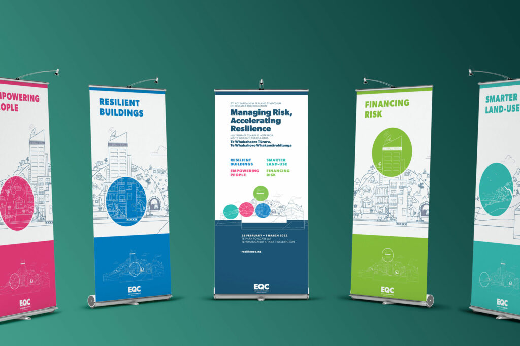
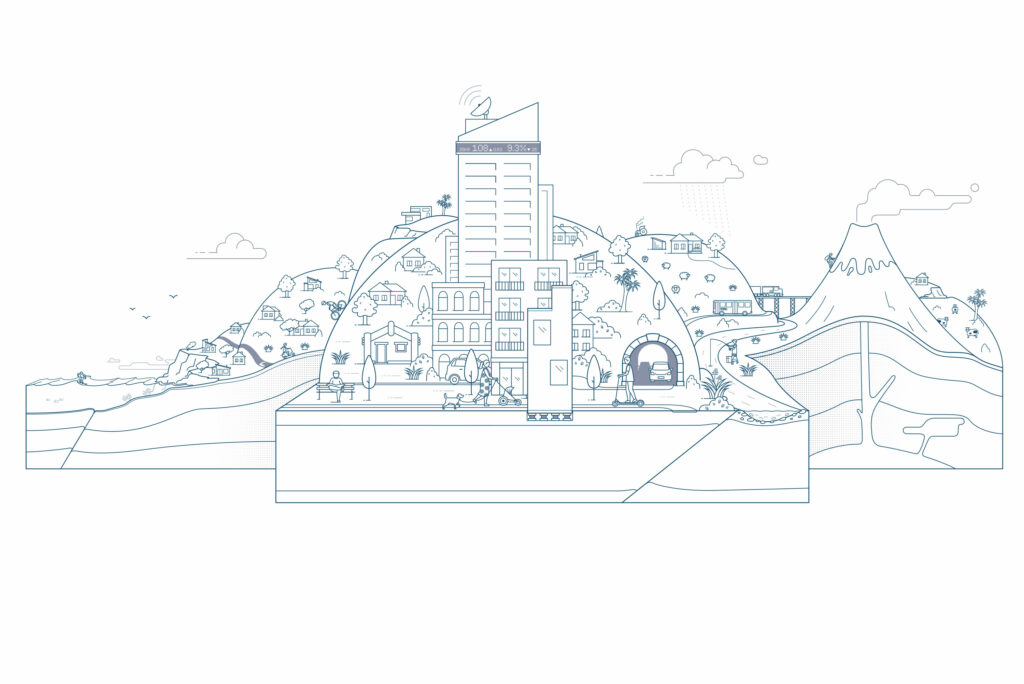
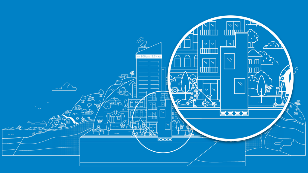
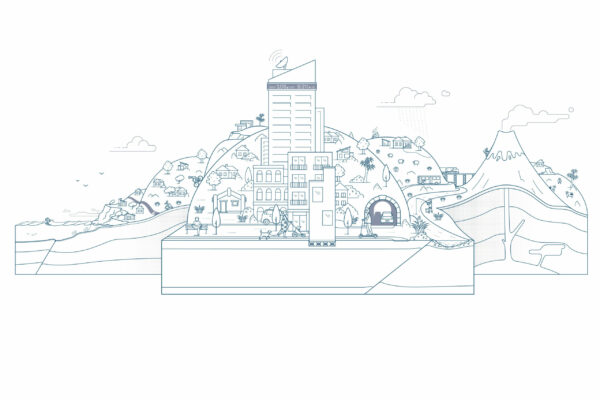
EQC needed event design for their resilience symposium and they asked Wonderlab to create a brand identity. It needed to visually relate to the established EQC brand as well as have it’s own distinct look. The event was to be held every year, so design longevity was also a brand consideration. The concept of ‘above and below ground’ with an illustrative approach was developed. Wonderlab created a unique visual language that was efficiently rolled out across all conference collateral. The brand created a strong recognition that is easily adaptable for future years.
The objectives
Bring together Government departments, local authorities, insurers and researchers to talk about resilience. Where all feel they have something to contribute, learn, and together create a safer, more resilient nation.
The goal
An event design that draws people in and sells tickets. With such a diverse but also specific audience, the design had to transcend stereotypes and bring something fresh to the table.
The process
We collaborated closely to create a uniquely kiwi ‘above and below’ illustration that covered all areas of risk and resilience, this process of iteration and attention to detail delivered the ideal result. The client was so happy, they even allowed us to create a cheeky ‘disaster’ version, adding some fun disruption for videos on social media.
The deliverables
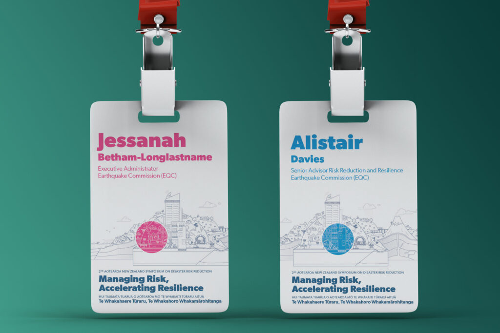
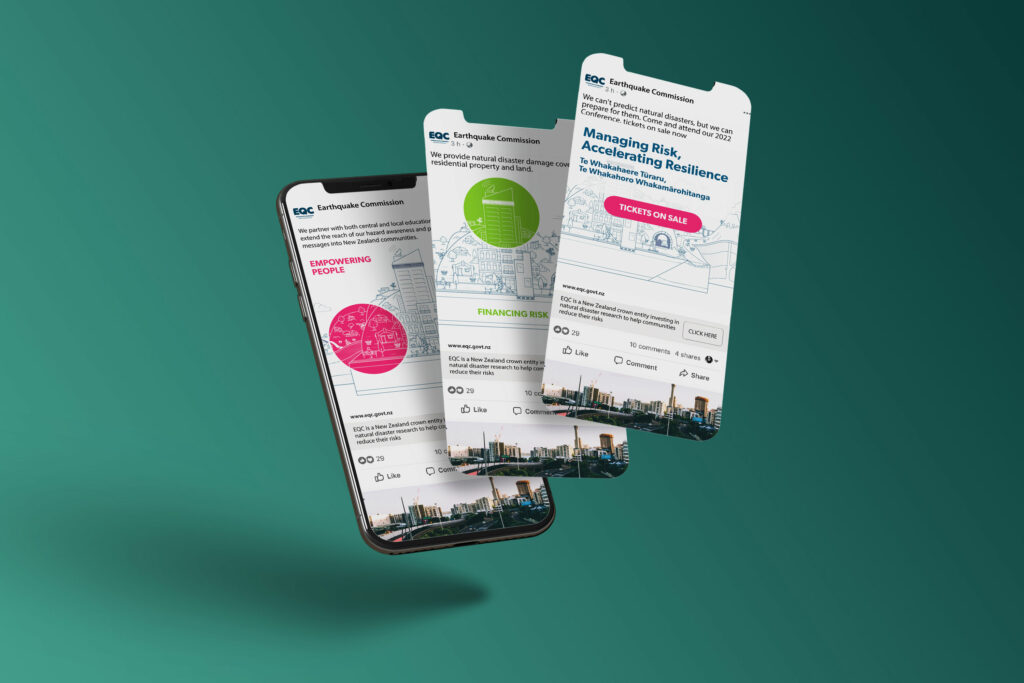
The event design identity was highly adaptable. It was easily applied to a full website with booking platform, name tags, programmes, social media, and digital banners.
