Wellington Water
Client
Work
Brief
Wellington Water had a very common graphic design problem: How do you get stakeholders to read important information when that information is dry and hard to comprehend? The project in question was their quarterly financial report, and their finance providers (all the local councils) needed to know where their money had gone. They asked Wonderlab for their clever design solutions.
The objectives
Re-invent a traditional financial reporting format to improve cut-through and comprehension.
The goal
Take ‘dry’ facts on water infrastructure finance and make interesting. Make complicated information and make it accessible. Show as much as tell.
The process
We did the hard work so others didn’t have to. We read the copy (yes, really!) and pulled out ideas, concepts and data. Meaningful and concise illustrations and info graphics were insightfully crafted.
The deliverables
A brand appropriate report that could be ‘read at glance’ via pivotal visual info-bites. Suitable for print and digital access. And we added a bit of animation to break down resistance.
Outcome
Feedback so positive that Wellington Water's other reporting documents are now following the same design concept and principles.
Simple format and simple sections
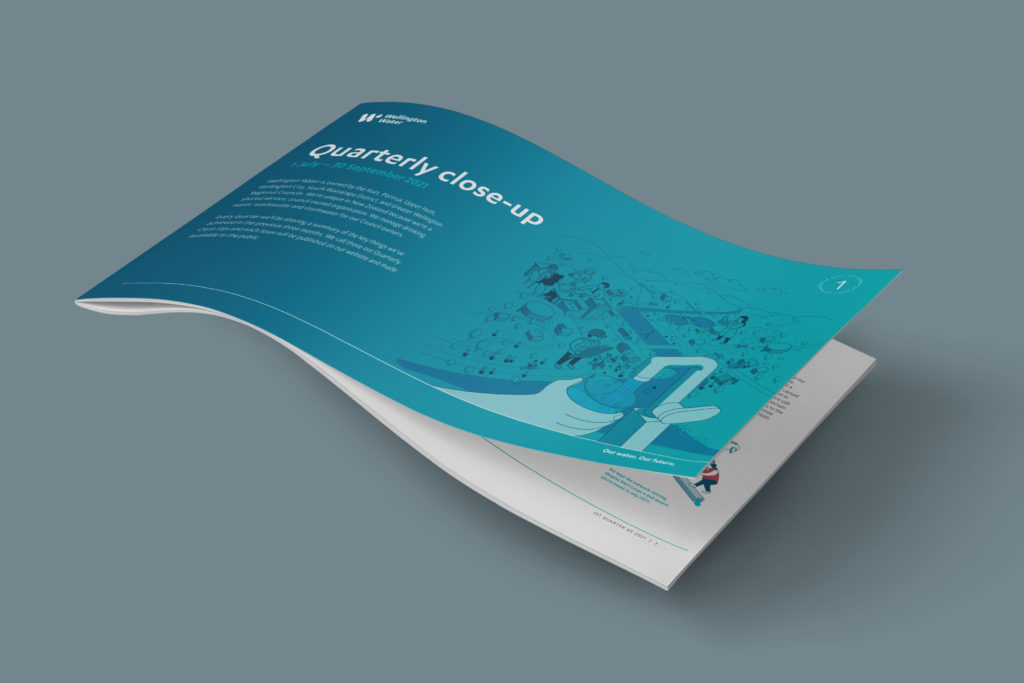
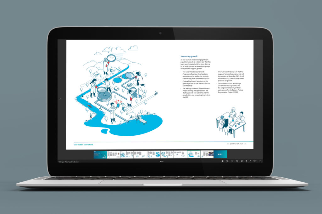
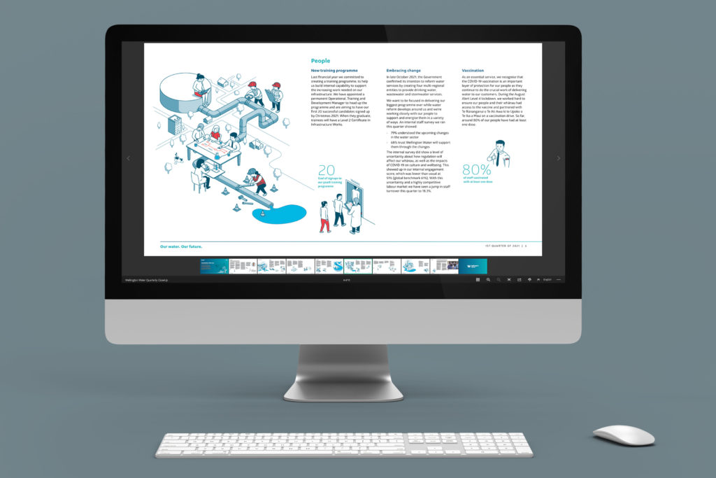
The whole report was turned on its side – better for screens. Information was broken into key reporting sections – better for reading.
Simple info graphic design
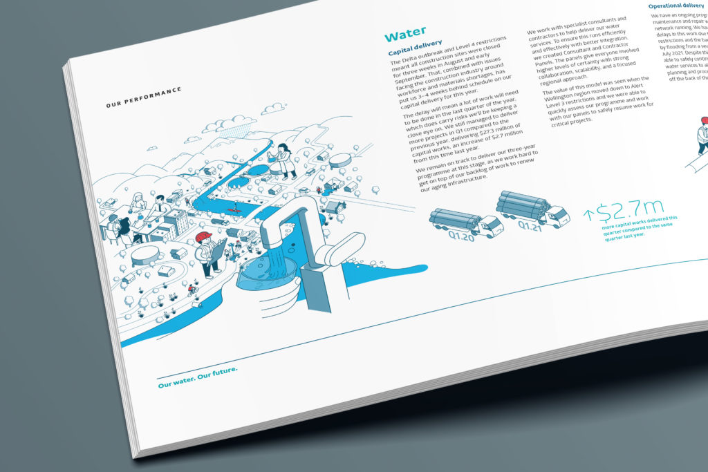
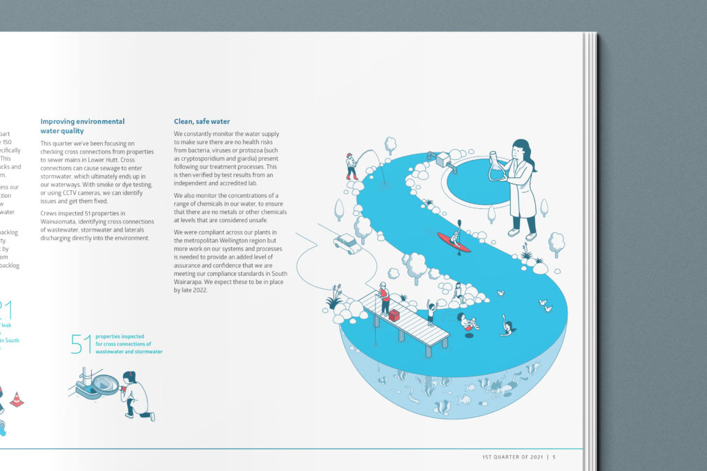
Each key reporting section had an amalgamated illustration and each key fact had an additional icon.
Simple solution
The solution was so simple and clear, the on going quarterly, and now bi-annual, reports will follow this template.
The Wonderlab long read on: Graphic design (NZ)
Achieving good information graphic design for corporate reporting
Information design is a critical part of corporate reporting. It helps to ensure that information is communicated clearly and effectively, making this information accessible to a range of stakeholders. Here are some tips for achieving good information design when communicating corporate reports:
• Use clear visuals: Visuals can help to make complex information simpler and easier to understand. They can also be used to highlight the key aspects of a report. When using visual elements, it’s important to ensure they are relevant, appropriate, and visually pleasing. It is also helpful to use visual elements strategically, placing them in places that will draw attention and provide the most value for readers.
• Utilize typography: The typeface you choose for your report can have an impact on how readable it is, so it should be chosen carefully. Choose fonts that are legible and inviting, as well as appropriate for the topic being discussed. Additionally, vary font sizes as needed to help guide readers through the report.
• Stick to brand colors: Color can be used to give emphasis and create hierarchy within a report, but it’s important to use it sparingly and with intention. Too many different colors can be distracting and hinder readability. Instead, pick a few simple colors, preferably brand colours that blend together well and complement each other.
• Consider white space: White space is essential for easy readability, so don’t be afraid to use it liberally throughout your report. Leave enough space between elements and text to help readers digest information more easily and focus on what matters most.
• Employ grids: Creating grids can help establish structure and keep elements organized and balanced. Grids also make it easier for designers and readers alike to identify which parts of a report belong together and to find their way around the page.
By following these simple tips, you can ensure that your corporate reports are both efficient and effective in conveying desired messages. Remember that information design should always be tailored to meet the specific needs of its audience, so take the time to consider who your stakeholders are and what they need from the report when designing it. With the right approach, you can create meaningful reports that are both visually appealing and easily understood.
